

There are a lot of idiots on social media. This will come as no surprise to most of you (to the rest … well, chalk up one more). For example, in response to the COVID Tracking Project’s update of weekly COVID-19 infection, hospitalization, and death data, this was posted:
Of course, such data are public and anybody can go and get it. So I did. Here is the Centers for Disease Control (CDC) “FluView” data showing about 4 recent influenza cycles (including the “bad” 2017-2018 influenza epidemic). Compare that to the ongoing COVID-19 pandemic. The number of deaths coded as being from influenza, charted vs. time in a typical year, PALE in comparison to the number of deaths coded as COVID-19 during the current pandemic.
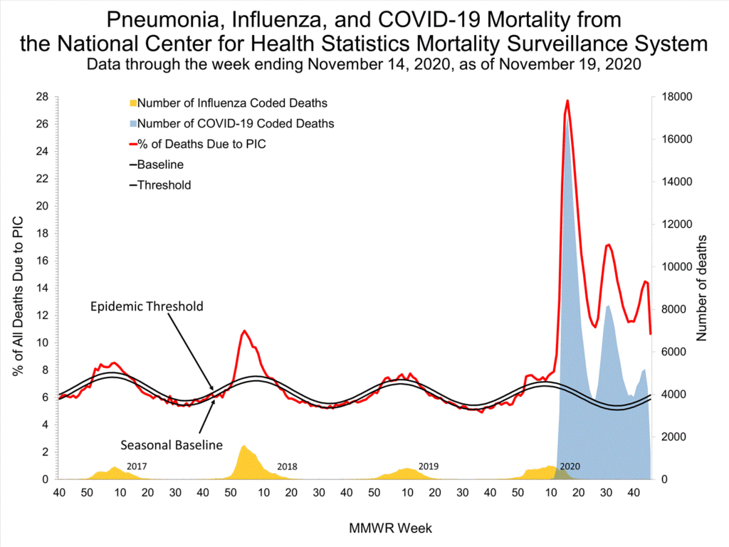
The most percentage of deaths caused by influenza was in the 2017-2018 flu season, capping out at about 11% of all PIC (essentially, respiratory infection) deaths at any moment in time. In contrast, COVID-19 has so far topped out at nearly 28% of all such deaths … and we’re only now entering the very worst phase of the pandemic, with complete national spread of the disease and surging of infections almost nationwide. We also haven’t yet seen the effects of the 2020-2021 flu, which would only make all of this worse.
Fun aside: I was suspicious the above account might be fake or a bot (meant to troll science accounts like the COVID-19 Tracking Project); despite having followers, the description of the account was halfway to a fever dream of nonsense. If you suspect an account is a bot, you can try to check that using https://botometer.osome.iu.edu/. It’s pretty cool. This account scored 1.5/5, so unlikely to be a bot. My own account scored 0.1/5. So it’s clearly not believable. 🙂
