
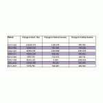
Updated 3/20/2010: added a reference for the median family income data. Corrected the table of trends, removing an incorrect cell-by-cell normalization (division by the number of years over which the slope was measured). Slope is ALREADY in units of “per year,” so an additional division was not needed. This in no way alters the conclusions, it only changed numbers by a positive multiplicative factor.
A recurring theme from the conservatives in government is that big government is bad for America. The flip side of that statement is that smaller government must be better for America. This has especially come up in the recent debate about health care reform. For instance, from the RNC website [1],
“We won’t continue to support big spending, big government, liberal ideas that are going to destroy the foundation and the fabric of America.” – Congressman Connie Mack
“Presidents during most of the late nineteenth century and the early part of the twentieth century were Republicans. The White House was in Republican hands under Presidents Dwight D. Eisenhower, Richard Nixon, Gerald Ford, Ronald Reagan, George H.W. Bush and George W. Bush. Under Presidents Ronald Reagan and George H.W. Bush, the United States won the Cold War, releasing millions from Communist oppression, in true anti-big government Republican spirit.” – From “Who We Are” on the GOP website [2].
I have, of late, begun to wonder: is big government good or bad? How would one judge this? The GOP likes to conflate big government with a negative impact on the American people. I decided to conduct my own study of the data and see what I could learn. So, here is my hypothesis: the size of government is correlated with income, and the correlation will be negative (that is, increasing government size will correspond to decreasing median income).
This hypothesis does not imply causation, only correlation.
To begin the study, I needed to obtain data on the size of government. I wound up contacting the U.S. Census Bureau and obtained this data for the period 1947-2007. The office was EXTREMELY helpful and immediately responsive. I obtained the data as a Microsoft database, which I could then import into Excel.
I then needed income data [3]. I decided to start with the income data provided by the census bureau. The best and most complete data I had was the average December salary of a federal employee. I multiplied this by 12 in order to obtain an estimated average yearly income. I took inflation into account and corrected all dollar amounts to 2007 dollars.
In addition, I went online and obtained census bureau data for median family income. This was a check against the federal employee data, in case their incomes don’t track with median family income. I also used this data normalized to 2007 dollars.
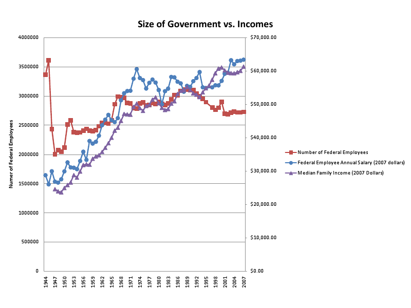
The results of a raw plot of the data is shown below:
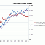
Trends in Government
If the number of federal employees can be taken as a measure of “the size of government,” then there are periods of trending that are of interest. The government was its largest in the last 70 years during World War II, with about 3.5 million federal employees. That number then dropped after World War II (1947) to about 2/3 that number. The size of government then gently or rapidly grew from 1947 to 1967, reaching 3 million employees.
From 1967-1981, the size of government decreased slightly or stagnated, reaching a low of 2.75 million during that period – never as low as post-WWII U.S. From 1981-1989, the federal government increased steadily and rapidly in size, from 2.8 to 3.1 million employees. During the 1990s, the size of government declined again to below the levels it achieved in the 1960s, except for a slight up-tick around 2000-2001. In the 2000s, the size of government stagnated, remaining approximately fixed at 2.7 million employees.
So, the size of the federal government was never as big as during WWII. Excluding WWII, the federal government achieved its maximum during this period in 1989.
Relationship between size of government and income
To explore the hypothesis, we can qualitatively compare the trends in government employee and family incomes to the size of government. Let’s begin with periods of increase in the size of government.
The size of government steadily increased from 1947-1967. During that same period, federal salary went from $24k to $46k and family income went from $25k to $43k. The next period of slow increase was from 1972-1981, during which time the average federal salary went from $61k to $55k and family salary went from $49k to $49k. The next period of more rapid increase in the size of government from from 1981-1989. During that period, federal salary went from $50k to $55k, and family income went from $50k to $54k.
Let’s then consider periods of decline in the size of government. The first of these is a short period from 1953-1954, during which time federal salaries went from $31.0k to $30.5k and family incomes went from $28.8k to $28.0k. The next period of decline is from 1967-1971, during which time federal salaries went from $45.9k to $54.1k and family incomes went from $43.1k to $47.0k. The next period of decline was from 1990-2002 (with the exception of a small spike upward in 2000). During that period, federal salaries went from $55.3k to $59.5k and family income went from $54.4k to $59.6k.
With the exception of the federal salaries from 1972-1981, salaries generally increased throughout the entire period. We should then look at the rate of overall increase as compared to the change in the size of government.
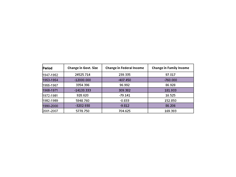
Quantitative Exploration of Government Size and Incomes
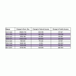
We can now look at the relationship between the change in the size of government and the rate of change in salary during the same periods.

The table shows the slope of a line-fit to the data in each period (representing change in the number of employees per year, or change in income per year). Looking at the table, we observe the following:
- Family income nearly always trends upward, largely independent of changes in the size of government.
- When government size trends down (highlighted in purple), family incomes trended UPWARD two out of three times. During the remaining period (’53-’54) there was a decline in family income.
- When government size trends upward, there are interesting income trends. Family income always trends upward during these periods; federal work income trends upward in all but two of these periods.
Computing the correlation coefficient of the family income numbers and the government employment numbers, the correlation is 0.78. It is positive, meaning positive increases in government size correlate with positive increases in salary. It is significantly larger than 0, meaning that there is a strong positive correlation. Naively, these sets of data ARE positively correlated.
Other Trends
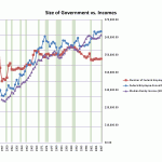
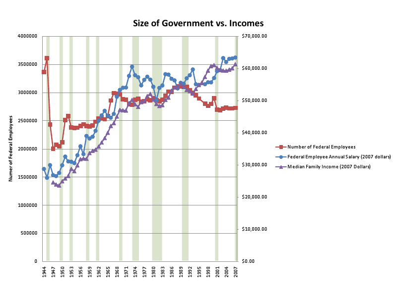
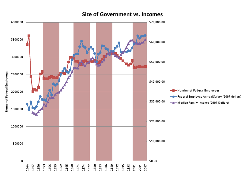
In addition, the chart of the data shown earlier has two variations. In one, the same data are shown with periods of recession overlaid in green. In the other, the same data are shown with periods of Republican control of the White House overlaid (since a Republican idea is at the heart of this study).
Let’s look at the recession data first [4]. Periods of long recession (more than 1 year) correspond very highly to periods when family income declines or stagnates. This isn’t a surprise, and is a good control for the data (you expect salaries to decline or stagnate during recessions). What happens to the size of government around recessions? Recessions do seem to correspond to times when there are changes in the size of government, but not clearly upward or downward changes. For instance, in the 1940s-1950s, recessions relate both to increases and decreases in the size of government. In later periods, changes in government size in either direction happen around the times of recessions.
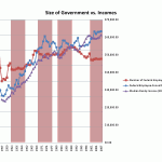
What about party control of the White House [5]? Well, here there are some clear trends. Except for Reagan’s and G. H. W. Bush’s Presidencies, Republicans tend to preside over periods when the size of government is flat or slightly declining. So, of the six Republican Presidents from 1944-2007, 4/6 presided over such periods. Reagan presided over the largest increase in the size of the federal government since 1965, when Lyndon Johnson was President. No Republican President presided over a large decline.
When Democrats are President, there are also clear trends. Truman presided over post-WWII America and, largely because of that, saw the single LARGEST decline in the size of government during ANY time from 1944-2007. His Presidency also saw an increase in the size of government after WWII. Kennedy saw a slight increase in the size of government, while Johnson presided over the next largest increase in the size of government. Carter presided over flat government size, while Clinton presided over the largest DECREASE in the size of the federal government since 1945. Of the five Democratic Presidents from 1944-2007, two presided over increases in the size of government, two presided over huge declines (Truman and Clinton, though Truman’s period was mixed), and one over a stagnant government size (Carter). So Democrats are more mixed, but at the extremes presided over the two largest declines in the size of government (Truman, Clinton) and two of the largest inclines in the size of government (Truman, Johnson).
Conclusions
There is a strong, positive correlation between the size of government and family income. This does not imply causation, only correlation; likely, there are external causes for these effects (e.g. growth in GDP), but this is only speculation. Periods of decline in the size of government correspond to increasing family income 66% of the time, while periods of increase in the size of government correspond to increasing family income 100% of the time. So income tends to increase regardless of the sign of change in the size of the government.
In addition, the income data seems to track recession data very well. Regarding the Presidential data, Democratic Presidents have presided over the two largest decreases in the size of government (Truman and Clinton), and Truman presided over a period of sharp increase in the size of government later in his Presidency. Presidents from both parties have presided over large increases in the size of government: Truman, Johnson, and Reagan. Republican Presidents tend to preside over periods of no, little, or slightly declining government growth, while for Democratic Presidents it’s more mixed.
The statement in the “Who We Are” section of the GOP website – “Under Presidents Ronald Reagan and George H.W. Bush, the United States won the Cold War, releasing millions from Communist oppression, in true anti-big government Republican spirit.” – is partly a falsehood. The data indicates that Reagan was, in reality, pro-government-growth. In addition, the statement that ” . . . big government . . . [is] going to destroy the foundation and the fabric of America” is also a falsehood. Based on incomes, big government isn’t destroying the foundation and fabric of America. The hypothesis that big government is bad for America, interpreted to mean “bad for incomes” and thus quality of life, appears to be false. They are both strongly positively correlated; or, perhaps, more accurately income goes up largely independent of what government size does. What the real cause of growth in either might be is left to a different study.
[2] http://www.gop.com/index.php/learn/who_we_are/
[3] http://www.census.gov/hhes/www/income/histinc/f07AR.html
[4] http://en.wikipedia.org/wiki/List_of_recessions_in_the_United_States
[5] http://en.wikipedia.org/wiki/List_of_Presidents_of_the_United_States


